
The district dashboard
The district dashboard is your starting point for everything that happens in one district. It is the level where monitoring stops being a statistic and becomes a list of real schools.
Monitoring activity
Section titled “Monitoring activity”The page opens with two bands of figures:
- All Time Monitoring Activity: school visits, teacher visits and pupil assessments across the district’s whole history, plus internal evaluations where they are used.
- Term/Period Monitoring Activity: the same measures for the period chosen in the header bar, plus an Active Monitors counter of its own.
Schools
Section titled “Schools”The Schools table lists the district’s schools with:
| Column | What it shows |
|---|---|
| School | The school, a link to its page |
| Teachers | The school’s teachers, as initialled chips linking to each one (a +N button expands long lists) |
| School visits | How many visits it has received |
| Last visit | When it was last visited |
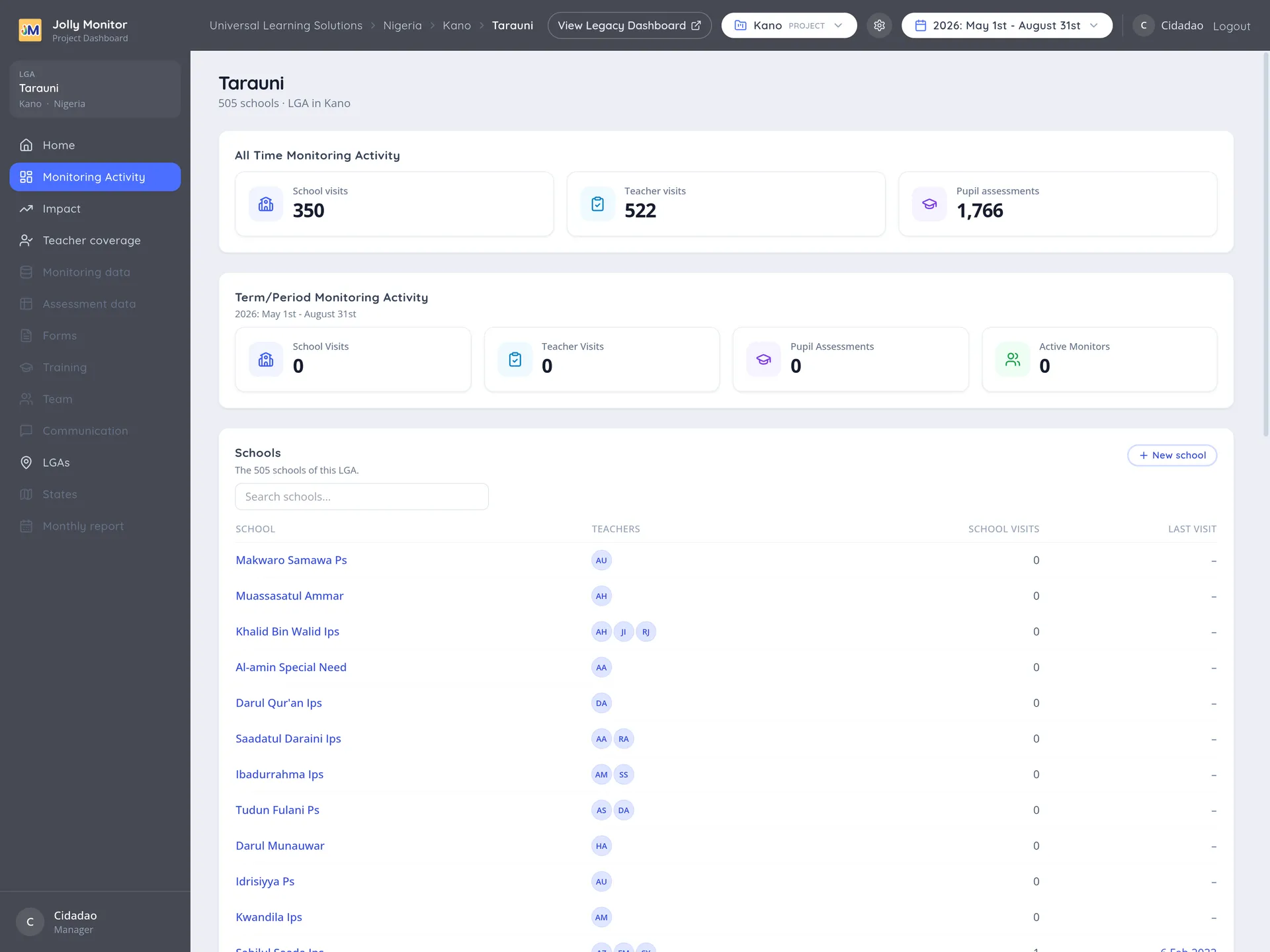
Show all expands the shortened table. New school (managers) adds a school to the district.
The visits map
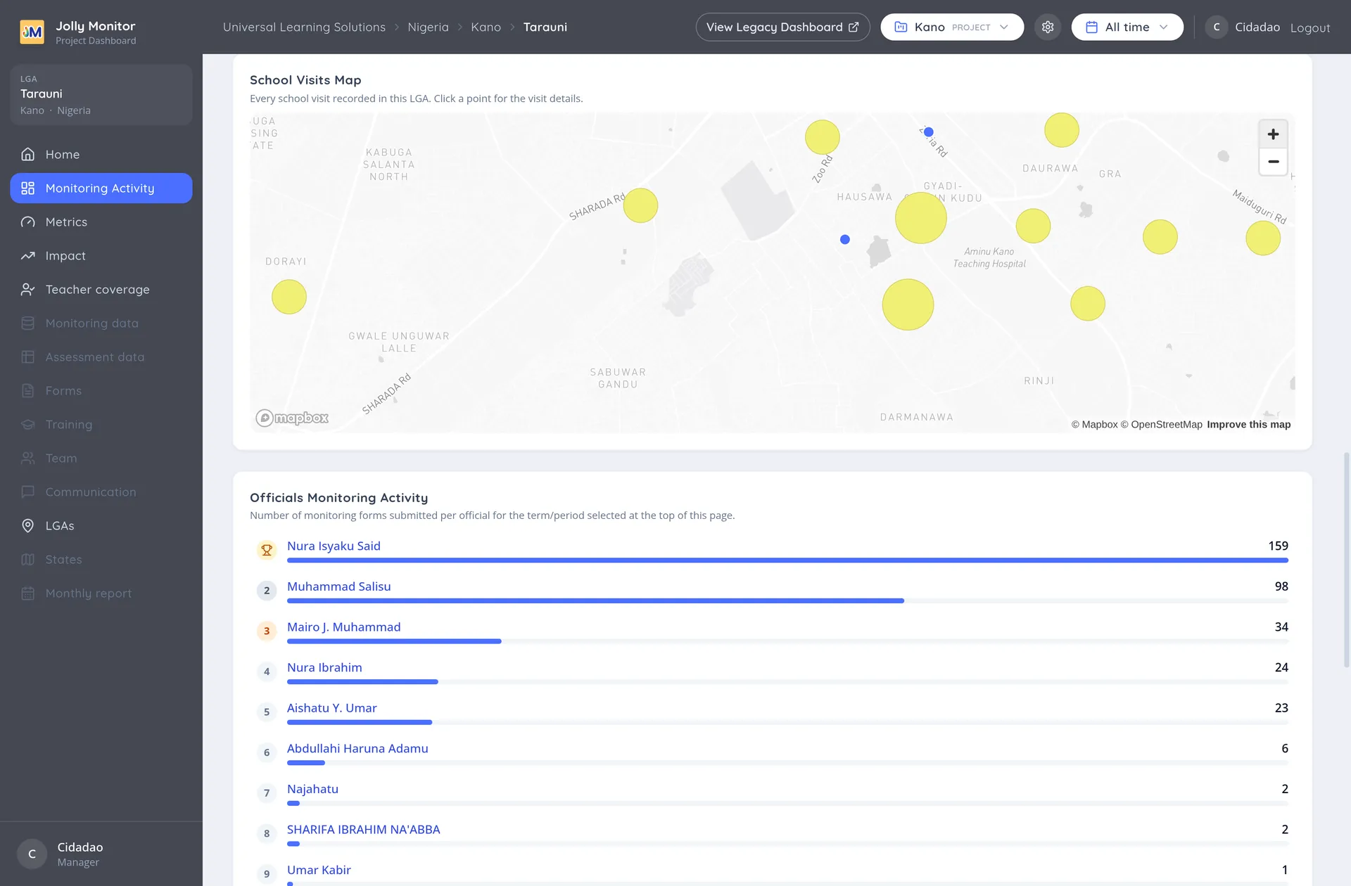
Section titled “The visits map”School Visits Map plots where visits actually happened. It answers a question the table cannot: whether coverage is spread across the district or clustered around the places that are easy to reach.
Read the map together with the last-visit column and the pattern usually explains itself.
Officials activity
Section titled “Officials activity”Officials Monitoring Activity ranks the people working in this district by what they have recorded. Names link through to their profiles.
Metrics and impact
Section titled “Metrics and impact”A district has its own Metrics and Impact pages in its sidebar, showing the same measures as the project recalculated for this district alone. That is how you find whether a project average is being carried, or dragged down, by one place. The Metrics page’s Results for each school goes one level further: every metric computed per school, which is the table that tells you which schools need the visit.
Teachers with and without visits
Section titled “Teachers with and without visits”The Teacher coverage entry in the district’s sidebar opens the coverage view, which lists, behind a toggle, the teachers who have not been visited in the period and those who have. Where the activity figures tell you how much monitoring happened, this tells you who was left out, which is the more useful question when planning.
See the coverage section of School visits and teacher visits for how to read it.
Impact for one district
Section titled “Impact for one district”The district’s Impact page reports the same Key Results as the project, recalculated for this district alone: the score brackets per year group, the target and the percentage reaching it, with the same colour coding.
Reading a district’s impact next to its project’s is how you tell a project-wide result from a local one. A project at 60% made of districts at 58%, 61% and 62% is a consistent programme; the same 60% made of 90%, 60% and 30% is three different situations that need three different responses.
The district’s own settings
Section titled “The district’s own settings”While you are inside a district, the settings gear in the header holds its own actions: senior managers get Download teachers CSV, which exports the district’s teacher list as a file to take into the field, and administrators also get the district’s Impact configuration and can Rename or Delete the district.
Going deeper
Section titled “Going deeper”A school name opens the school page, with its teachers, classes, visits and internal evaluations.
Next: The School page