
The country dashboard
When you open a country, you land on its Monitoring Activity page. This is the home page for a single country. Country officials always land here, and managers reach it by choosing a country from the organisation overview’s Countries table or the scope selector.
The country’s sections
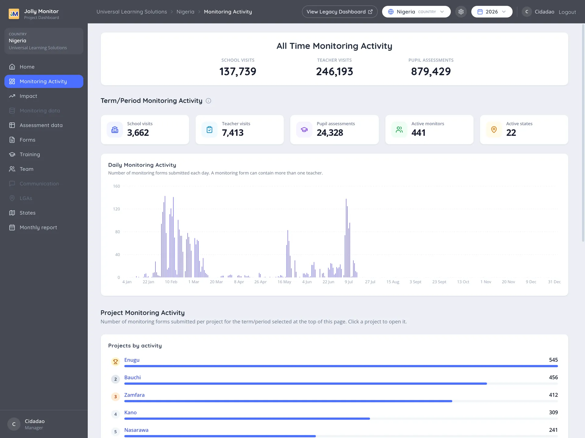
Section titled “The country’s sections”Inside a country these are the sidebar’s active sections:
| Section | What it shows |
|---|---|
| Monitoring Activity | Visits, observations and assessments activity. Described below, and the page you land on |
| Impact | Pupil and teacher results against targets. See Impact |
| Assessment data | The country’s assessment reports and sample groups |
| Forms | The country-wide monitoring and assessment reports, grouped by what they report on |
| Training | Training figures and events. See Country trainings |
| Team | The country’s monitors and officials |
| Regions | The country’s regions. This entry is named with your country’s own word, so it reads States in Nigeria |
| Monthly report | A single month at a glance. See Monthly report |
The Monitoring Activity page
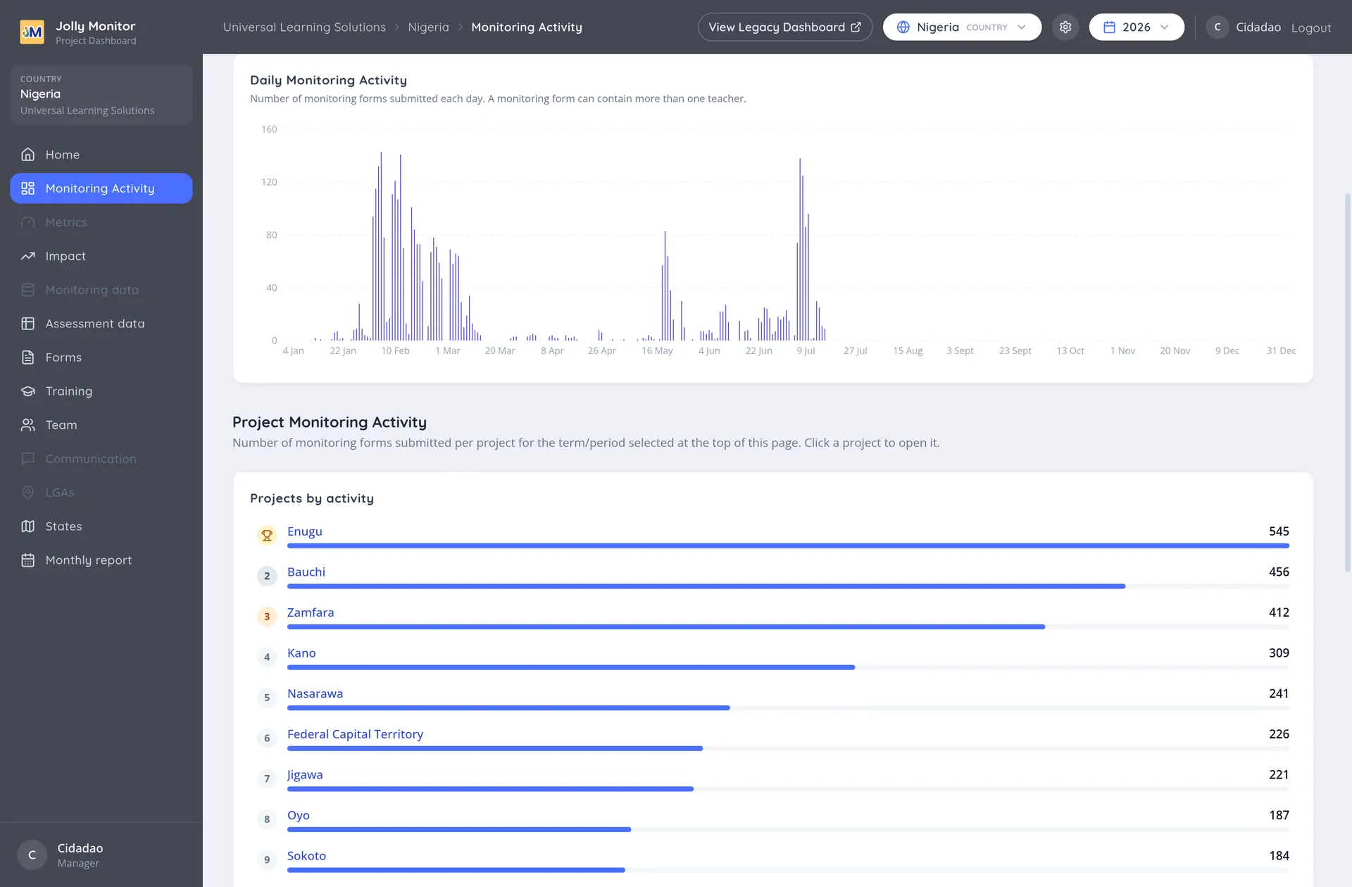
Section titled “The Monitoring Activity page”Monitoring Activity pulls together everything that has been recorded in the country and lets you narrow it to a period.
All Time Monitoring Activity
Section titled “All Time Monitoring Activity”At the top is an All Time Monitoring Activity block, covering everything recorded in the country regardless of the period selected. It is the fixed reference point: whatever you do with the period selector, these figures stay put.
The period selector
Section titled “The period selector”The period selector in the header bar picks a school year, a term, All time, or your own dates. Everything below the all time block reloads for the period you choose.
Term or period counters
Section titled “Term or period counters”Term/Period Monitoring Activity repeats the same measures for the chosen period, so you can read the current term against the all time totals directly above it. It adds two counters of its own: Active monitors and Active regions (named with your country’s own label, so it reads Active states in Nigeria), which tell you how many people and how many parts of the country produced that activity.
Daily Monitoring Activity
Section titled “Daily Monitoring Activity”A chart of activity day by day. This is where patterns show up that a total hides: a term starting late, a fortnight where nothing was recorded, or a burst of catching up before a deadline.
Project Monitoring Activity
Section titled “Project Monitoring Activity”The number of monitoring forms submitted per project for the selected period, ranked, so you can see which projects are carrying the country’s activity. Each project is a link into its own dashboard.
The comparison tables
Section titled “The comparison tables”Below the chart, Projects by activity, Officials Monitoring Activity and Project Staff Monitoring Activity rank where and by whom the work is being done. See Leaderboards for how to read them.
Long tables are shortened, with a View all link to see the rest and Show all columns where more measures exist than fit on screen.
What is different from the old dashboard
Section titled “What is different from the old dashboard”If you knew the previous country dashboard, three things have moved:
- The tab bar across the top has become the sidebar. The same reporting is there, one entry per former tab.
- The three header tiles (Visits, Internal Evaluations, Trainings) are gone. The landing page is now Monitoring Activity itself, whose figures cover the same ground in more detail.
- The Configuration gear has moved into the header bar and its contents are grouped per level. See Country configuration.
The View Legacy Dashboard link in the header opens the older interface, which is still available while the new one settles in.
Moving around from here
Section titled “Moving around from here”Names in these tables are links. A project opens that project’s dashboard, a monitor or official opens their profile. From a project you carry on down to its districts, then schools, then teachers. The breadcrumbs across the top let you climb back up at any point.
Next: Impact