
What metrics are
A metric is a single measured number that the dashboard works out from the data your monitors and teachers collect. Most metrics are a percentage, but some are a plain count. Each metric carries two extra things alongside the number: a target (the value you are aiming for) and a colour that tells you, at a glance, how close the number is to that target.
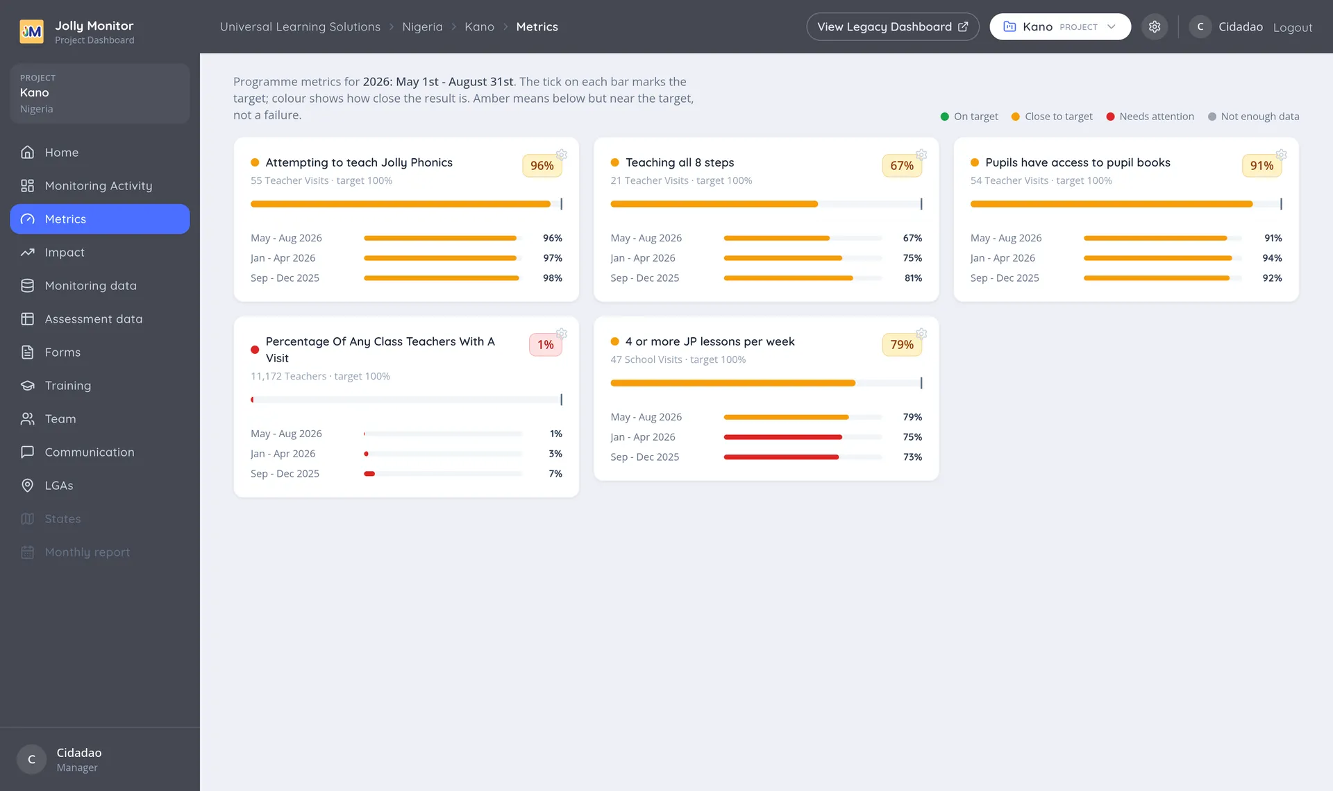
The three parts of a metric
Section titled “The three parts of a metric”Every metric has:
- A number. Usually a percentage, sometimes a count (for example, a number of messages sent).
- A target. The value you want to reach. It appears as a tick on the metric’s bar, so you can see the gap rather than having to work it out.
- A colour. Which of four states the result is in.
The four states
Section titled “The four states”The Metrics page (the sidebar entry of a project) states its own legend, which is worth reading literally:
| State | What it means |
|---|---|
| On target | The result has reached or passed the target |
| Close to target | Below the target, but near it |
| Needs attention | Well below the target |
| Not enough data | Too few records to say anything |
The width of each colour band is not set by hand. It comes from the target and a setting called the proximity division, covered in Creating and editing a metric.
The sample size behind a number
Section titled “The sample size behind a number”A percentage on its own can mislead, so every metric shows the sample size next to it: for example “55 Teacher Visits · target 100%”. The sample is one of:
- Teachers (for example, teachers in a district)
- Teacher visits
- School visits
- Pupil assessments
- SMS (messages)
So “96% attempting to teach Jolly Phonics” over 55 teacher visits is a solid finding, while the same percentage over three visits deserves caution. Not enough data appears when there is no sample at all; a small sample still shows its number, which is exactly when reading the sample size matters most.
Always read the number together with its sample size. It is shown right beside the metric for exactly that reason.
Results over recent periods
Section titled “Results over recent periods”Percentage metrics show their result for the current period and for the periods before it, so you see the direction of travel rather than a single snapshot (plain-count metrics show only the current value). A metric that reads 67% now and 75% and 81% in the two previous terms is telling a different story from one that has climbed to 67%.
Where a metric is defined and used
Section titled “Where a metric is defined and used”A metric is defined once at country level, then attached to one or more projects. Only the projects you add will display it.
Once attached, the same metric is shown at every level of the programme:
- Country (as the country Impact’s teacher indicators, across all projects)
- Project (one region)
- District
and across time, by term or by a date range you choose. The number is recalculated for whichever level and period you are looking at, but it is the same metric throughout, which is what makes two districts comparable. On a district’s Metrics page, Results for each school opens the full schools table, and the teacher-question metrics carry a View failing teachers link that breaks their result down to the individual teachers, grouped by school.
Examples of real metrics
Section titled “Examples of real metrics”These all exist in the dashboard:
| Metric | What it measures | Typical sample size |
|---|---|---|
| Percentage of teachers with a visit | Share of teachers who received a monitoring visit | Teachers |
| Attempting to teach Jolly Phonics | Share of observed teachers found teaching it | Teacher visits |
| Teaching all 8 steps | Share of observed teachers covering the whole method | Teacher visits |
| Pupils have access to pupil books | Share of visits where pupils had books | Teacher visits |
| Percentage of pupils passing an assessment | Share of pupils reaching a chosen pass score | Pupil assessments |
| Number of SMS sent | Count of messages sent | SMS |
The pattern behind most of them is worth noticing: you can turn almost any monitoring question into a metric by choosing a question and the answers that count as a pass. That is how programmes track things like “percentage of classrooms with a print-rich environment” straight from the question monitors answer in the field.
Where you view metrics
Section titled “Where you view metrics”The dedicated Metrics page shown above lives in the project sidebar, with each metric’s bar, target tick and recent periods; inside a district, the same sidebar entry shows the district’s own numbers. The same figures also appear as the teacher indicators on the Impact pages, and as items inside custom reports.