
The Monitoring Activity tab
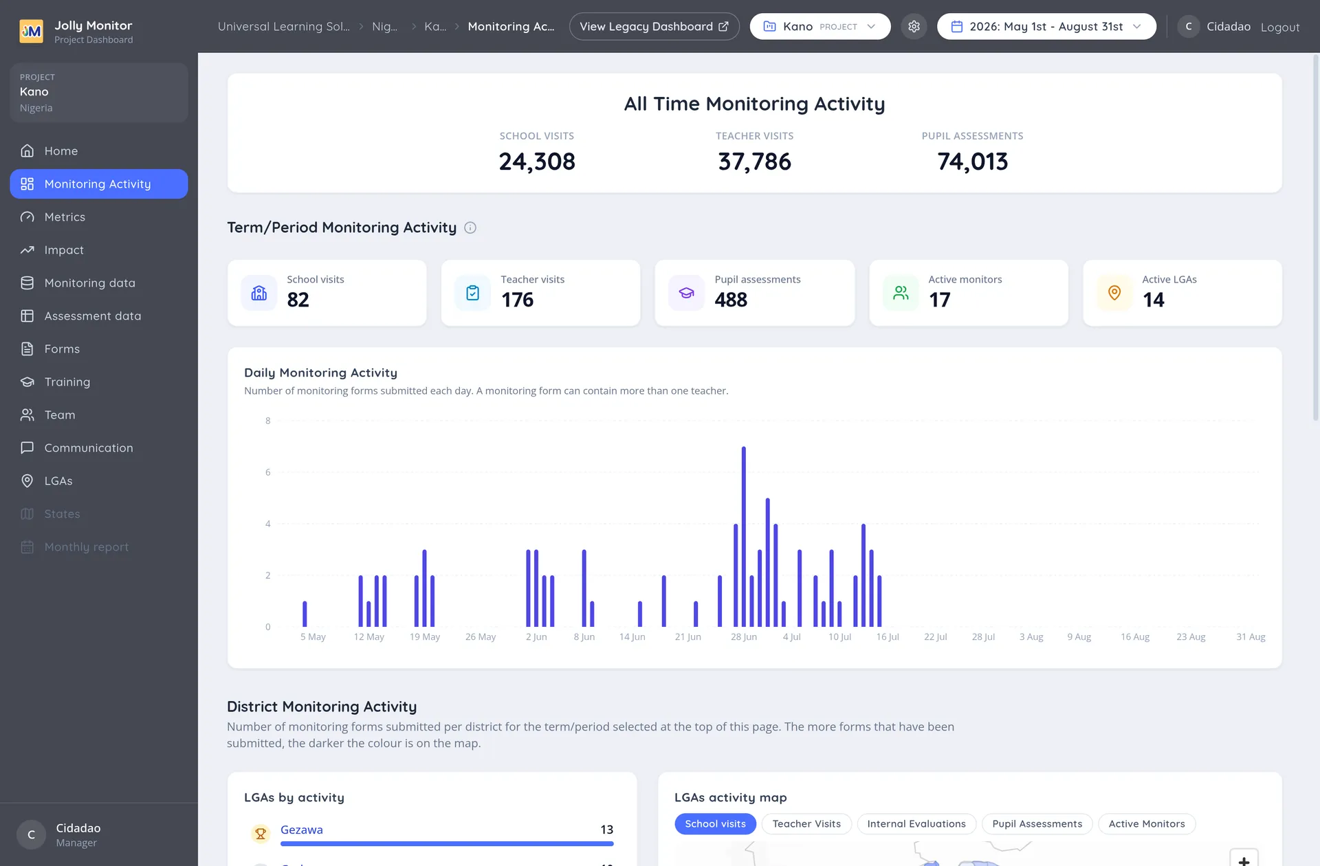
Monitoring Activity is the activity view of a project, and the page you land on when you open one. It gives you a single picture of how much monitoring has happened, who has been most active, and how each district compares.
A project maps to one region, the level your country calls States or Regions: opening the project is how you work with that region’s monitoring.
The project’s sections
Section titled “The project’s sections”The sidebar always lists the same sections; inside a project ten are active, and the two country-only entries (the regions and the Monthly report) appear greyed out with a hint. The ten:
| Section | What it shows |
|---|---|
| Monitoring Activity | This page, and the one you land on |
| Metrics | The programme metrics with their targets. See What metrics are |
| Impact | Results against targets. See The Impact tab |
| Monitoring data | The answers monitors submitted. See The Monitoring data tab |
| Assessment data | Pupil results in reports and sample groups. See The Assessment data tab |
| Forms | The project’s monitoring forms, each with its questions and how much it has been used. Opening one shows its figures and the monitors assigned to it |
| Training | Training events and numbers. See The Training tab |
| Team | The monitoring team. See Project Staff |
| Communication | SMS and WhatsApp groups. See The Communication tab |
| Districts | The project’s districts, named with your country’s own word, so it reads LGAs in Nigeria |
What changes with your role is the buttons: the editing and team-management actions appear for managers, and the setup pages live behind the settings gear (senior managers and administrators).
All Time Monitoring Activity
Section titled “All Time Monitoring Activity”At the top, the All Time Monitoring Activity heading sits above a row of key figures. These totals cover the whole life of the project and do not change when you switch the period below. If the project uses internal evaluations, a count of those appears here too.
The period selector
Section titled “The period selector”The period selector in the header bar picks a term, a school year, All time, or your own start and end dates. Everything below the all time figures reloads for the period you choose.
Period counters
Section titled “Period counters”For the period you select, a row of counters shows:
- School visits
- Teacher visits
- Pupil assessments
- Active monitors
- Active districts, under your country’s own label, so it reads Active LGAs in Nigeria
Projects that use internal evaluations get a counter for those here too.
Daily Monitoring Activity
Section titled “Daily Monitoring Activity”The chart shows monitoring forms submitted each day across the period. It is where the shape of the term becomes visible: a slow start, a gap in the middle, or everything squeezed into the final fortnight.
District Monitoring Activity
Section titled “District Monitoring Activity”This section ranks the project’s districts by how much monitoring each has done, and pairs the table with a map of the region shaded by activity. The map has selectable layers, so it can shade by school visits, teacher visits, internal evaluations, pupil assessments or active monitors, and clicking a district opens its details.
Reading them together is the point. The table tells you the order; the map tells you whether the quiet districts are the far ones, which is usually the real explanation.
Long tables show the top ten with a View all link to the rest, and Show all columns for the measures that did not fit.
Officials and Project Staff activity
Section titled “Officials and Project Staff activity”Two further tables rank the people doing the monitoring: Officials Monitoring Activity and Project Staff Monitoring Activity. See Project leaderboards for how to read them fairly.
Internal evaluations
Section titled “Internal evaluations”Where a project uses internal evaluations, they are counted separately from monitor visits throughout this page: their own counter among the period figures, and their own totals in the all time block.
Keeping them apart is deliberate. A monitor visit is external evidence and an internal evaluation is a school assessing itself, so mixing them would let a project’s monitoring figures be inflated by its own internal work. Seen separately, they answer two different questions: how much monitoring is reaching the schools, and how much quality assurance the schools are doing themselves.
Teacher activity
Section titled “Teacher activity”Projects that run internal evaluations also get a table of the teachers doing them, with their evaluations and pupil assessments. It ranks the teachers most engaged with the programme, which is the closest thing the dashboard has to a view of self-driven practice.
Moving around from here
Section titled “Moving around from here”Everything on this page is a way in. A district opens its own page with its schools; a monitor or official opens their profile with their own visits. From a district you carry on to a school, its teachers, their visits and the assessments taken during them.
The breadcrumbs at the top of every page climb back up the chain.
Next: The Impact tab